To define the visual part of a brand you have to completely understand the business it will represent. Its key provision and message act as a basis for how that visual language develops.
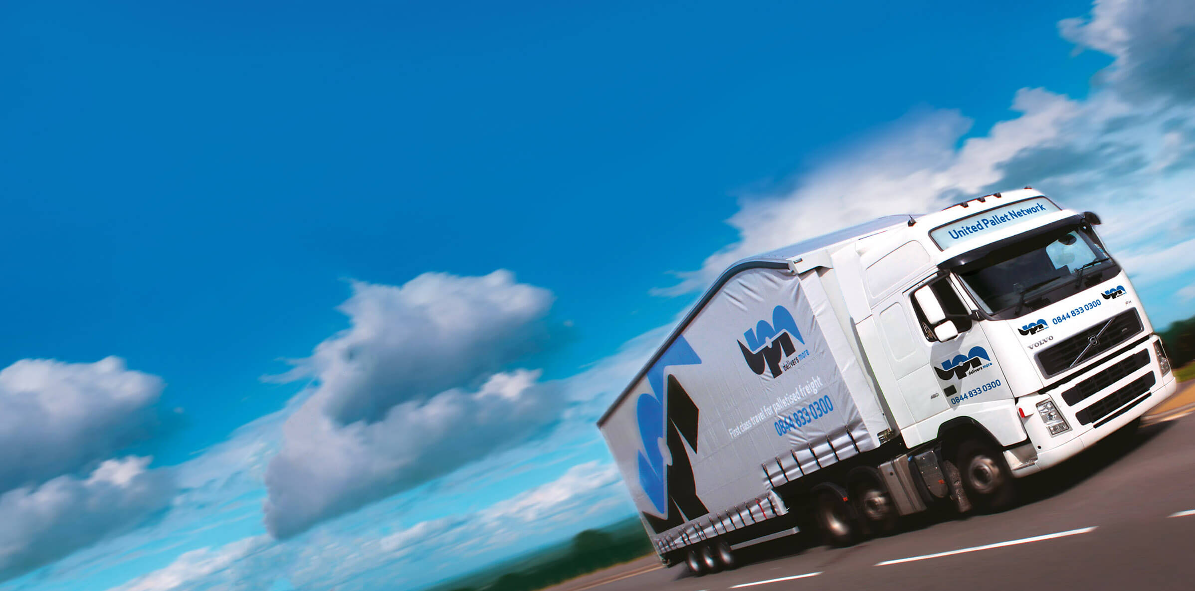
UPN is a network of service providers for logistics. The network it has created provides hubs that allow each member to increase their efficiency. With UPN’s model a member only has to provide delivery for their own area, if a delivery needs to go further it’s taken to one of the hubs where the completion of a delivery is undertaken by a member in the target area.
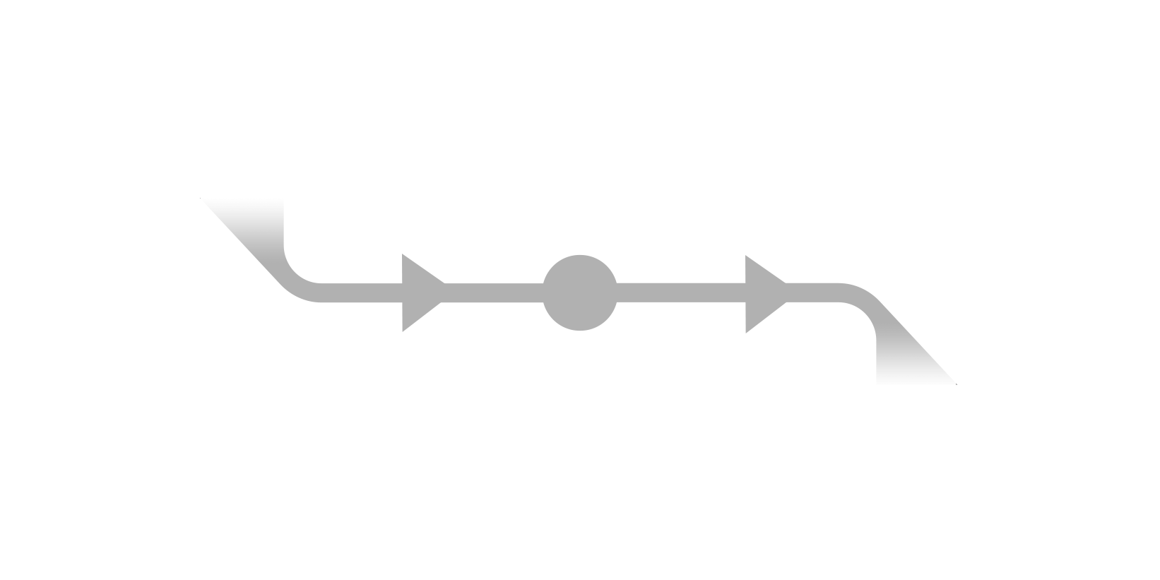
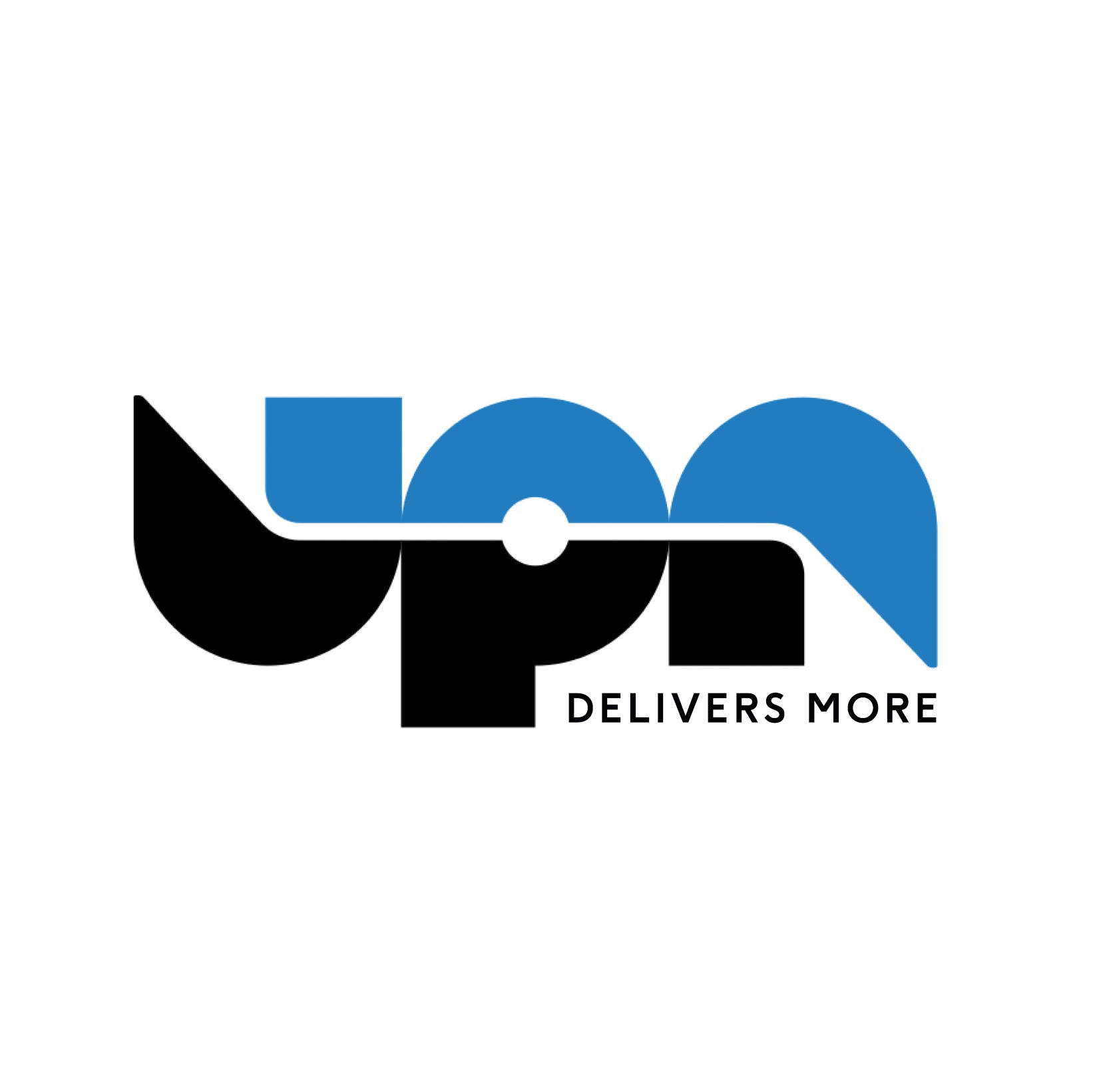
This inflow and outflow from the central hub seemed a key point to build on visually. Much like the great Fedex logo that uses negative space to great effect but in a subtle manner we felt it important that any visual signalling should not be over powering.The new branding has subtle communication points with a modern yet timeless look to help UPN move forward as a business. Since we started working with UPN creating both their new branding and web platform the company has seen huge growth with net worth increasing 400%.
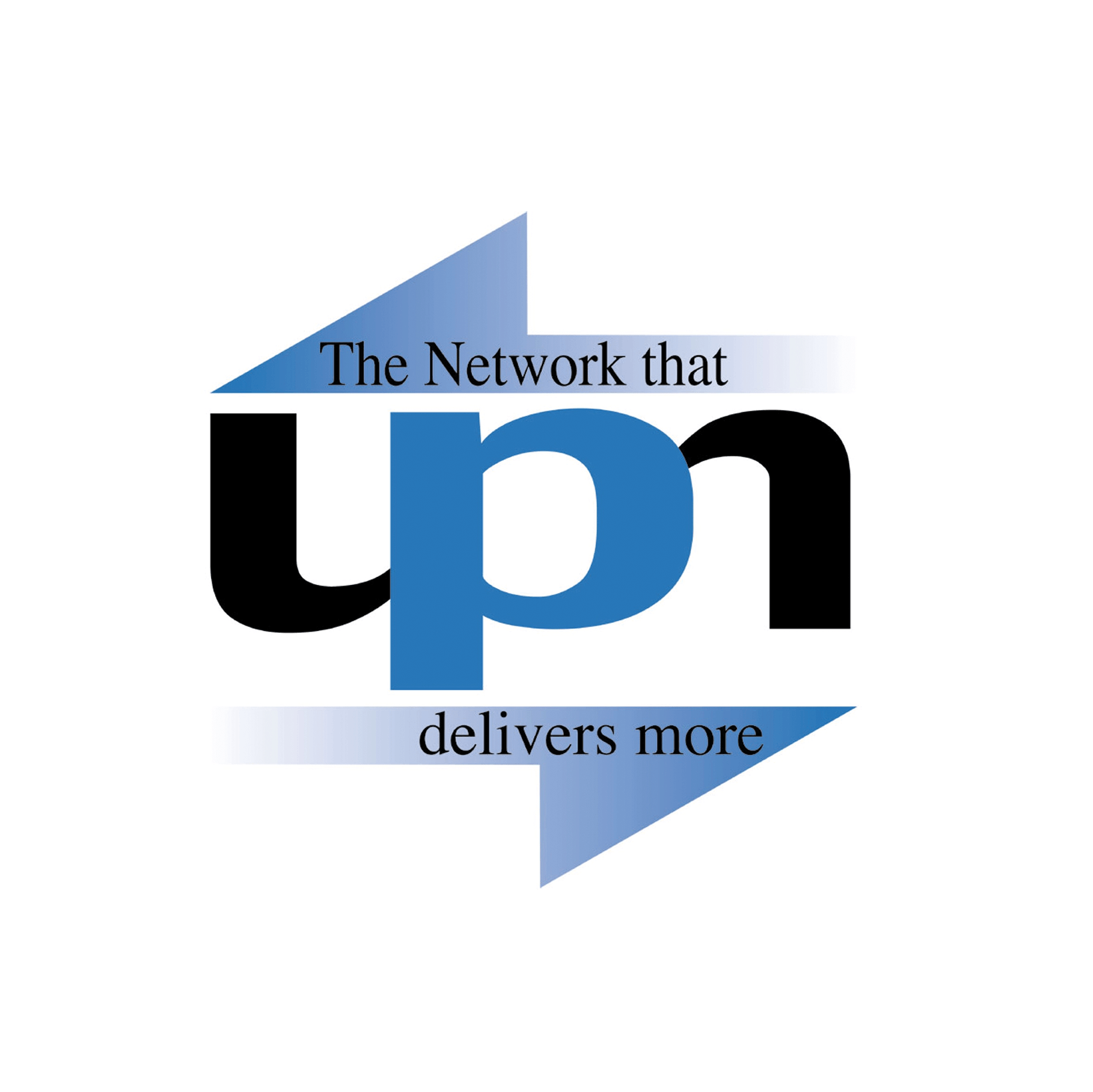
Hover over the above to see the old branding prior to our work.